How to Compare Data When You Move from Google Analytics to GA4
How do you compare your data when you move from Universal Analytics to Google Analytics 4 (GA4), or some other analytics package? Learn how to size up a lot of data very quickly using a simple algorithm you learned in high school.
Once you move from Google Analytics to Ga4, you can be assured that your data will not match exactly. In fact it may be off by a percentage.
What is more important is that relative changes from day to day, week to week, and month to month are of the same magnitude in both systems.
Is the GA4 data correlated with the UA data?
For example, if we graphed the Universal Analytics (UA) metric Users against the GA4 metric Active Users, it might look like this:
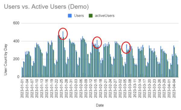
It is clear that UA consistently reports more Users than GA4 active users on a day-by-day basis.
The blue bars are the users reported by UA and the green bars are the active users reported by GA4 on a daily basis. It’s clear that UA is reporting more users than GA4 is reporting acitve users.
This is to be expected, because active users are calculated differently by GA4 than is users.
What is more important is that they move similarly to each other day after day. In other words, if GA4 is going to report fewer active users, the magnitude of the difference between it and UA should be consistent, day after day.
For most days this appears to be true. But some days, UA reported many more users than GA4 reported active users.
Does this mean that we can’t trust one or the other? There is a way to find out.
Scatter Plots, Not Bar Graphs
The bar graph is a crude tool for comparing two data sets. In fact, any time-series graph is going to disappoint.
What we need is a Scatterplot.
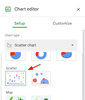
The Scatterplot graph in Google Sheets
A scatterplot ignores the order of the date and instead compares the data on each day. On a day that UA reported 200 users, how many active users did GA4 report? We plot that point.
When we do it for each day in our data set, we might see something like this:

Scatterplot graph of Users from UA vs. Active Users from GA4
What you might notice is that this data lies in a straight line, for the most part. This is a good sign. It means that the GA4 data changes relative to the UA data for each of the days mapped.
This doesn’t mean that it’s accurate, though. Here’s a scatterplot of the same data, but I’ve artificially doubled the daily UA data.

A scatterplot in which the value of one dataset has been doubled. It looks pretty much the same.
This data looks good, but it’s not. How would we know?
Spreadsheets and your high school math teacher give us a simple way to evaluate the data like a boss.
Add a Trendline
First, Google Sheets will calculate a trend line for us. When at science events, we call this a linear regression. This is the straight line that best “fits” the points. If the points look like a line, then the trend line will be a close approximation of the data. In Google Sheets you’ll find this in the Customize tab under Series >.
These features exist in Excel as well.
When we add a trend line to our data, we see this:
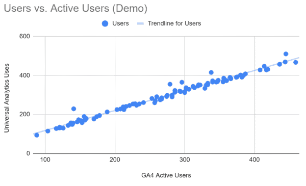
The trend line matches the data very closely. But how closely?
That draws a pretty line right along with our data. How closely do the two data sets match? That’s what R2 tells us.
Reading the R2 Value
If you’re curious about how this is calculated, here’s a helpful video.
Google Sheets will calculate R2, but this is not enough. We want the equation of the trend line so that we know how closely related the two data sets are.
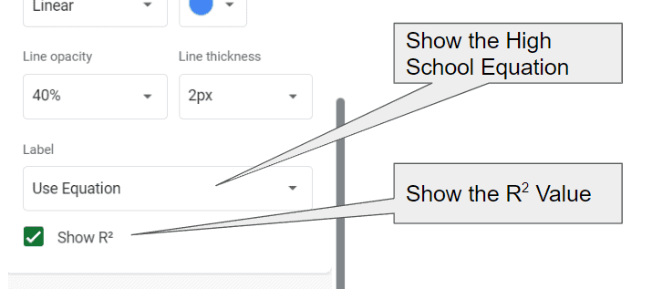
In Google Sheets, set the Label field to “Use Equation” and check the box labeled “Show R squared”.
There are some mathy looking bits in our legend now.
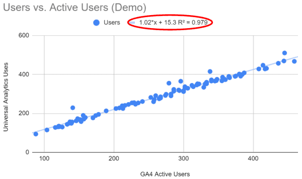
The R squared value tells us how closely the data “fits” our trend line and the equation describes the trend line in detail.
The R2 number tells us how well the trend line describes our data. A perfect fit would give us an R2 value of one. The closer to one it is, the more likely our two data sets are describing the same thing.
The equation is the one you learned in high school. It’s just the equation of a line.
The Equation of a Trend Line
This is one of those equations that you swore you would never use in math class. Today, it’s going to give you X-ray vision into your data.
y = mx + B
x is the GA4 Active Users
y is the UA Users
The choice of x or y axis is arbitrary for a scatterplot.
m is the “slope” of the line. It’s the “rise over the run”. If we expect our two datasets to be alike, we expect a slope very close to one.
B is the “y intercept”. It is where our line crosse he vertical axis, also called the “y axis” when x is zero.
We’re hoping that our GA4 data is as much like our UA data as possible. If the two were reporting the exact same number each day:
- R2 would be 1
- The slope (m) of the line would 1
- The y intercept (B) would be 0
I compared two identical data sets to show this.
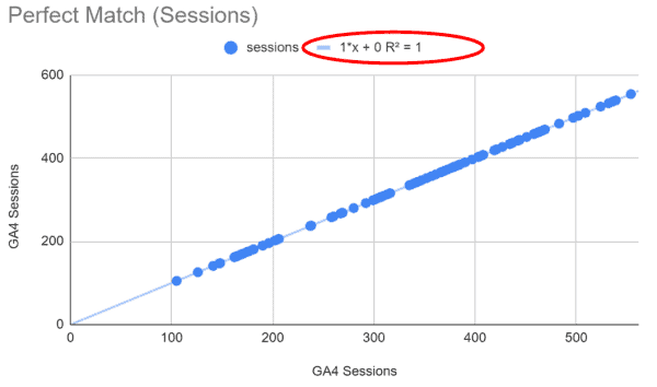
Two identical data sets. The R squared value is 1. The slope is 1.
The y-intercept is 0.
So, what if our data isn’t perfect?
If R2 is significantly less than one, the two data sets are not well-correlated to each other. In other words, they are not describing the same thing. If it’s 0.9 or above, we feel pretty good about the comparison. If its below 0.8, we should be worried.
Even if R2 is close to one, the slope (right before “x”) might be significantly less than one. In this case, we would find that that one dataset is adding or subtracting a percentage of the true value. It could be doubling the count of users, or not reporting users on some percentage of the pages of your website.
If the R2 value his close to one and the slope is close to one, we may find the y-intercept to be higher than zero. This means that some consistent value is being added to one or the other dataset. One is counting something that the other is not.
Here are some common scenarios we see in comparing UA and GA4 data, and how the equation would be expected to change.
You’re comparing the wrong data.
Let’s start off by looking at a bad correlation. Here the R2 value and slope are near 0. The y-intercept is very high.
Something is just not right here. Maybe you’re not pulling the data right.

Both the R2 value and slope are near 0. The y-intercept is way above 0. This is data that doesn’t correlate.
Bot traffic is not being filtered in one dataset.
In this example, I’ve artificially added 50 users per day to one of the datasets. This is what it would look like if GA4 was filtering out a consistent traffic source, like bot traffic, but UA was not.
The entire trend line will is lifted by 50 users. Because it’s consistent, the slope and R2 values are not affected. But the y-intercept will rise precariously.
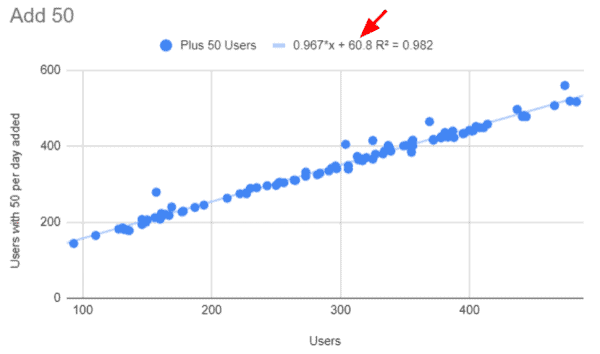
Adding 50 users to one dataset increases the y-intercept, even though the slope and R2 values are near one.
You’re double counting.
It’s remarkably easy to double-count by adding the Google Analytics tag twice. In this case, the slope will be close to 0.5 (or 2.0 if you flip the x and y axis in your scatterplot).
It’s not unusual for us to find a website that is adding pageviews using an on-page tag and a tag manager tag. This will double-count pageviews.

When you double the users reported in one dataset, the slope will approach 0.5 or 2.0.
You are “breaking” sessions.
If you are “breaking sessions” in either dataset, you’ll see inflation of sessions. This will be reflected in the slope. It will be significatnly above or below one.
For example, if you use a utm_ query parameter on a call-to-action button on your site, UA will start a new session, as if the user was just arriving on the site. GA4 doesn’t do this.
If your visitors are going to a third-party site and returning, you can get broken sessions. If you have cross-domain tracking setup in UA but not in GA4, you’ll see something like this for the segement of visitors that visit the other site.
The analytics tag is missing on some pages.
With this example, I’ve added 50% to the dataset on the Y axis. This simulates the scenario in which 33% of the pages on the X-axis dataset don’t have tags.
Note that the R2 value doesn’t change. However, the slope of the line is well below 1. In fact, it’s about 2/3 of a perfect slope.
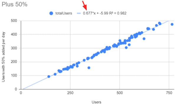
When adding 50% to one dataset, you find the slope changing even though the R-squared value is the same.
Revenue, Transacations and Segments
This approach can be used to check most of your metrics and segments.
Not only can you evaluate the data you are collecting, you can evaluate your ability to pull data in GA4 that represents the thinking of the UA developers. UA data is pre-processed differently in UA than it is in GA4.
This is a great way to be sure you’re pulling similar data segments.
Compare Google Analytics to your sales data.
If you want to be sure Google Analytics is collecting ecommerce data, you can compare transactions from GA to transactions from your backend, such as Shopify, BigCommerce, Magento, etc. This approach is great for that.
This is one of the first things we do with or new Conversion Catalyst clients.
The graphs look the same. Don’t be fooled.
Be careful when you move from Google Analytics to GA4.
In all of these examples, the scatterplots look pretty much the same visually. However, our high school math teacher has equipped us with the equation we need to diagnose our data.
Thanks, high school math teacher!


