infographics

If the Zombie Apocalypse struck tomorrow, and the only way not to become the walking dead was to throw away your mobile device, who would be the winners and losers?

According to an intriguing infographic, you’d be more likely to be file-swapping on Dropbox than binge-watching on Netflix. You’d be more likely to get your news the same way your grandparents do. You’d be back to reading the New York Times online instead of Buzzfeed, which now interprets world events by comparing them to your favorite episodes of Friends.

Would you have predicted that Sears would suddenly be more popular than Pandora.  I guess we’ll be needing somewhere to buy a new Walkman to take to the gym.

Somehow Google would still manage to rule the Internet world which is hardly surprising since

“Encarta it” just doesn’t have the same ring as “Google it.”

In case you’re wondering where Encarta falls into the mix, I had to Google it to read a Wikipedia article about it.

This little thought exercise underscores the winners and losers in the mobile game. Many businesses claim that mobile isn’t important enough yet, or that their offering doesn’t lend itself to mobile. Netflix and Buzzfeed dominate their marketplace in part because they embraced mobile early and often.

If you believe your visitors are hunched over a desktop when they visit your site, you are setting yourself up to be the mobile-unfriendly loser in your marketplace. Are you creating your own Zombie Apocalypse?

Ask Conversion Sciences how we turn low-converting mobile visitors into leads and sales.

And let’s all breathe a collective sigh of relief that Craigslist would still be a solid option for finding your next creepy roommate since its popularity doesn’t take quite the hit of more fashion-forward websites in this mobile-devoid alternate universe.

This infographic from Ecommerce Platforms gives us some insight state of eCommerce in 2015.  It’s looking like online sales are going to increase to well over a quarter of a billion dollars (yep, you read that right:  billion!), and even though retail sales online are still a relatively small percentage of total sales, brick-and-mortar shops are still feeling the pinch.
What piece of the ecommerce pie will your business get? It depends where you are. Note how much European shopping behaviors vary by region.
The 10% increase in ecommerce revenue is up for grabs. Your ability to capitalize will be based in large part on the conversion rate, or revenue per visit that you get from your site.

A 10% increase in buyers plus a 10% increase in conversion rate could deliver you 21% growth in topline  revenue in 2015.
A 10% increase in buyers plus a 10% increase in conversion rate could deliver you 21% growth in topline  revenue in 2015..
The State of eCommerce in 2015
 
Thanks to ecommerce platforms for creating this.


We’ve all seen the numbers. Visual content outperforms text-only content by a landslide.
Need a refresher?

  • Content generates up to 94% more views if combined with compelling visual elements and graphics. (MDG Advertising)
  • 40% of people will respond better to visual information than to plain text. (Zabisco)
  • High quality infographics are 30 times more likely to be read than text articles. (Ansonalex)

While I’ve known these stats for some time, I didn’t feel like there was much I could do about it until recently. I would make sure to break my articles up with nice subheadings and insert quality stock photos or original photography when I had it, but that was about as visual as I got. “After all,” I thought, “I’m a writer—not a designer.”

How I Became More Visual

Things changed when I started writing a weekly column for a client whose company designs and builds custom homes. The column was to appear as sponsored content on a well-known luxury living blog. My goal was to conduct interviews and research on the latest trends in home design and present my findings in 500+ word articles along with some beautiful photography of the client’s work.
My logic was simple: The photography was already performing extremely well on social media. The pictures would be the hook, and people would stay for the insightful article.

The first article of the campaign. It goes on for over 600 words.

The first article of the campaign. It goes on for over 600 words.

While this approach already seemed to be working on the client’s on-site blog, it didn’t have the effect I wanted it to on the sponsored column.
In fact, my first article performed pretty badly, despite all the effort I had put into conducting interviews, despite the great quotes and useful information I used—even despite the photos that had been shared thousands of times on social media. The first article—a piece that used anecdotes and advice from the client about finding inspiration for your home—received 84 views upon publication and continues to be one of the lowest performing posts of the campaign, with a total of 220 views.

The tiny blip made by my first article. We used tracking pixels to watch traffic on Google analytics. As you can see, traffic did not pick up after posting.

The tiny blip made by my first article. We used tracking pixels to watch traffic on Google analytics. As you can see, traffic did not pick up after posting.

Then I started using Illustrator

I had been fumbling around with the program for several months, but never felt like I had time to use it properly. My approach had always been to write the best copy I could and to let a designer help out if they had time. But this time I was determined to do something—anything—different so that the column would prove worthwhile.
So I went ahead and designed some images for my next two posts—just some simple, vector-based elements to use as featured images and between subheadings. They weren’t great, but they were presentable, and the articles performed slightly better than the last.
I wasn’t sure if the slight increase in views warranted the extra time it took to create new visuals, but I decided to give it one more shot.
I’m glad I did.
Taking a cue from fashion magazine style collages, I cobbled together a collage using pieces of our original photography and used it as the central element of the next post. The post received 524 views on the first day of publication—over six times more views than my initial post. Even better, the post continues to rack up views, with 1,626 views to date.
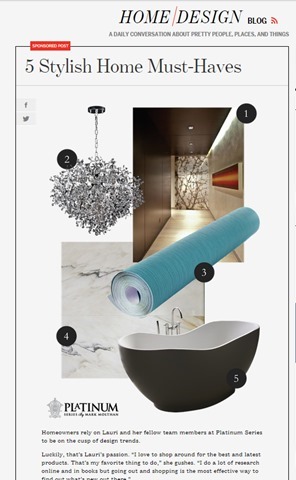
My first post on the site to be primarily visual.

My first post on the site to be primarily visual.

Since posting that article, I have continued to create similar content for this campaign (and others) that have performed just as well.
My next post also used a collage. It received 504 views on the first day of publication. Interestingly enough, this article was on the same topic as my initial failed article—how to find home design inspiration. The difference was all in how the information was presented.

Spikes in traffic from my first two collage posts done in Illustrator.

Spikes in traffic from my first two collage posts done in Illustrator.

A few months later, new posts continue to create spikes in traffic, and we begin to gain a consistent viewership between postings.

A few months later, new posts continue to create spikes in traffic, and we begin to gain a consistent viewership between postings.

While I don’t have all the answers to this change in performance, I attribute the success of the collage articles to two things: 1. their overall presentation, and 2. their particular appeal to my audience.

Overall Presentation

  • They stand out from surrounding posts in the blog roll.
  • In a sea of photographs, a small piece of graphic design can really stand out.
  • They look original.
  • Readers who are already engaged with the client’s brand may have already seen our best photography. These images made them brand new.
  • They look useful and cohesive.
  • A simple collage with numbered items promises practical, bite-sized content. Plus, people want to be shown how information relates. Sometimes, placing a great photo next to text isn’t enough.

Appeal to the Audience

  • They mimic the look of luxury magazine and blog articles.
  • In researching our audience, I checked out several sites that our demographic enjoys. (Facebook’s recent expansion of its search function is great for this task.) They gave me examples of the kind of short-form blog posts that our target audience typically reads.
  • They account for the audience’s browsing behavior.
  • If your prospective customers are visually inclined, too much text is a nuisance. By creating visual content, I was able to provide the kind of bite-sized articles that that my audience expected in that context.

Growing your capabilities will make you more perceptive.

There are probably several lessons to be learned from this incident, including one about knowing your audience. But the one I want to stress is this: learning how to design will make you a better writer.
How do I know? I’m not just basing this claim on the spike in traffic that came after I started creating visuals. I’m also basing it on the fact that now, when I set out to create content, I don’t ask myself, “How can I best express this idea through copy?” I ask, “What is the best way to express this idea? Period.”
I am also better able to take into account the browsing behavior of my audience. I wouldn’t be writing this out as a 1,000+ word article if I didn’t think that the audience of The Conversion Scientist was willing to read longer articles. Similarly, the content you create should cohere with the browsing behavior of the people you want to reach. No matter how great your writing is, you will never convince a non-reader to read—at least, not through a piece of content marketing.
Because I can now create a broader variety of content I also think much more about the behavior of my audience. That’s why learning Illustrator has not only made me more versatile—it has also made me more perceptive. If copy is only a small part of the equation, I can combine my strengths as a writer with my (developing) ability to design to create content that is cohesive, concise, and valuable.
Colleen Ahern, The Conversion ScientistColleen Ahern is a copywriter and content marketing strategist at Page Agency. She created the Page Agency Blog, where she writes about the rapidly evolving world of content marketing and social media. Follow her on Twitter @ColleenAhern.

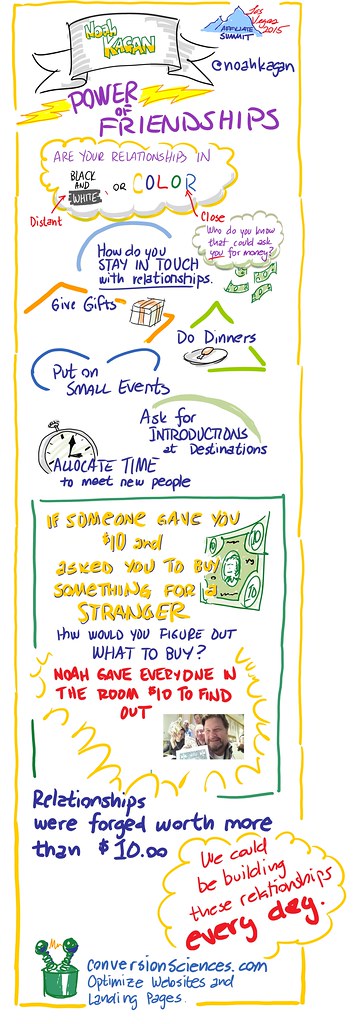
It’s unfortunate that I have to fly to Las Vegas to catch fellow Austinite Noah Kagan. However, I was glad to have caught his keynote at Affiliate Summit West 2015.
Mainly because he gave everyone in the audience $10. Real money.
Is he so desperate for attention that he has to buy an audience with cash? Maybe. But his little stunt was really to make a point. His question is, “Are your relationships in black and white, or full color?”
I captured the highlights of his presentation in this instagraph infographic drawn in real time. Share it with someone.

Affiliate marketers get conversion optimization.

I was gratified at how sophisticated the folks at Affiliate Summit were. Affiliate marketers understand that conversion optimization is a big lever that increases CPA payouts, makes advertisers happy and sets OPMs apart from the competition.
And it’s all we do at Conversion Sciences.

noah kagan infodoodle


The year 2015 will be full of surprises, but not everything needs to be a total shocker. We can start planning now for some of what 2015 will bring.
So, what should we be focusing on?
I am privileged to know some smart entrepreneurs and marketers, the kind of people who would have an informed opinion about 2015.
Give it a read and know that these bright folks (and me) aren’t guessing. Take these online marketing tips and do your own research.
For me, Peep Laja summed it up best:

“Be your own benchmark. Aim to do better than you did last month.”

A few good friends of ours are quoted in this image – if you’d like to see them in person, consider coming to ConversionXL Live in April.
2015 Marketing Tips
Hat tip to tribes.no

Content Marketing guru Michael Brenner has four kids. That violates my rule of parenting: “Never let them outnumber you.” He seems to be handling things fine, and even made the kids a part of his inspiring Ascend Summit presentation “The Future of Content Marketing.”
Michael says, “Content Marketing has always been about connecting through stories people love.” and “The Future Content Marketing is entertaining.”

Content Marketing and Stories

“Marketing has always been about connecting through stories people love.”
“60% to 70% of marketing content goes unused.”
“73% of people would not care if the brand they bought went away.”
“80% of CEOs are dissatisfied with their CMO.”
“Newspapers have lost $40 billion in revenue in the last 15 years.”
“The future of marketing is entertaining.”

Four Great Content Hubs

American Express OPEN Forum
Red Bull
taste by William Sonoma
Target
Here is my “instagraph” infographic recorded during his presentation.

Michael Brenner-The Future of Content Marketing

Click to Enlarge


The folks at WhoIsHostingThis.com have put together a very complete infographic on mobile advertising.
We like articles and infographics that support their findings with research and case studies.
One thing we’d like to put a fine point on is this:

Formula: Number of mobile site visitors divided by the number of actions taken, all multiplied by 100 to give the conversion rate.

Responsive vs. Dedicated Mobile Site

We are seeing in the literature more evidence that responsive designs suppress mobile conversion rates. The primary culprit is load times. We are currently recommending the Native Mobile Website approach for phone-sized screens.
Furthermore, many sites are displaying mobile sites on tablets and phablets that have the resolution to show more. This may be suppressing conversion rates as well.
Everything You Need to Know about Mobile Ads - Via Who Is Hosting This: The Blog
Source: WhoIsHostingThis.com

As former head of Moz.com, Rand Fishkin is a guy who knows his stuff when it comes to SEO and search marketing in general. I had the pleasure of meeting and hearing him speak at Business of Software USA in Boston.
And I took notes.
I captured a live instagraph infographic for you since you couldn’t make it. You can download Rand’s slides.

Key Takeaways

“Google doesn’t want to count links that you can build.”

“Build relationships, not links.”
“Aim for resource pages and blog rolls.”
“Buy exposure that leads to links-Tabula, Outbrain, etc.”
“Do PR”

Share Socially

Tweets do affect rankings, but cause and effect are not clear.
Google+ your content. It will rank higher for your G+ network.

Content Marketing

If you’re in the bottom 15% of publishers, focus on quality over quantity.


Team, tech, process and scale: these are the primary components shared by Tania Shershin of Homeaway at the Which Test Won Live Event in Austin, Texas.
We captured the high-points of her presentation live in this instagraph infographic.
If you want to create a culture of testing in your organization, here is a roadmap to success.


21 Quick and Easy CRO Copywriting Hacks to Skyrocket Conversions

21 Quick and Easy CRO Copywriting Hacks

Keep these proven copywriting hacks in mind to make your copy convert.

  • 43 Pages with Examples
  • Assumptive Phrasing
  • "We" vs. "You"
  • Pattern Interrupts
  • The Power of Three

"*" indicates required fields

This field is for validation purposes and should be left unchanged.


© Copyright 2007 - 2024 • Conversion Sciences • All Rights Reserved
Conversion Sciences® and Conversion Scientist® are
federally registered trademarks of Conversion Sciences LLC.
Any unauthorized use is expressly prohibited.