How to Create the Highest Converting Registration Forms
Discover how to create top converting registration forms for your website or landing pages. Don’t let the design of your form hurt your conversion rate.
Are your forms stopping your visitors from converting on your site? Follow these guide and create the highest converting registration forms ever. Of course, this will not preclude you from testing what works and what doesn’t work on your site and with your audience. Read on!
Steps for Creating Top Converting Registration Forms
I recently went to a website to buy a new keyboard for a laptop. I found the site with the right price and delivery and put the keyboard in my cart.
When I went to checkout, the first question on the billing form was Gender.
Gender?
Why does an electronics part manufacturer need to know if I’m a man or woman?
It introduced enough doubt in my process that I left — I abandoned my order.
The unfortunate statistic is that 86% of visitors abandon forms of all kinds.
It’s doubly heartbreaking when they do so in their cart, because that costs you ready buyers.
How to Create the Highest Converting Registration Forms: 13 Key Tips
The thirteen recommendations made here will set you on a path to reduce your abandonment rates. My favorites are:
- What am I signing up for? Use a title that explains why the user needs to sign up. Keep this intro short, sweet and simple. Make sure your call to action matches the title. Be more creative than a “Submit” button.
- Show them their password (who said invisible passwords was a good idea?) Let them pick if they want to see it or not.
- Put errors in an obvious place and make them visible. Make sure to read the last section on how to use error messages as a conversion opportunity.
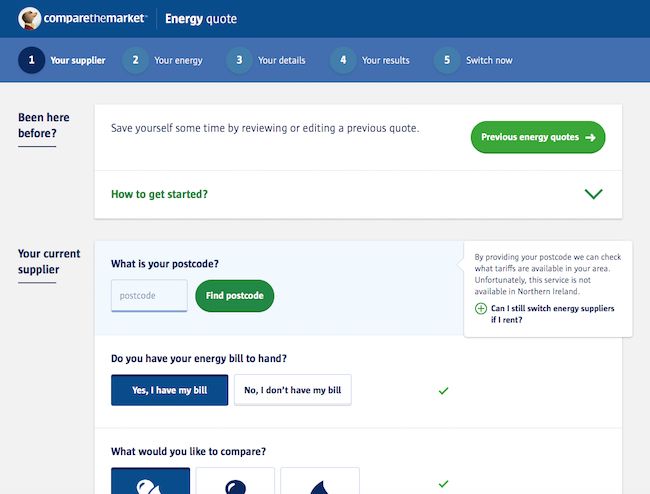
How to create top converting registration forms: informational messages make for a smoother conversion path when they are located close to the corresponding field. Easy to notice and to understand.
Here’s the rest of the recommendations for creating top converting registration forms.
- A social signup option can speed up the form filling process and help you create the best conversion registrations forms.
- Leverage Autofill whenever possible or offer preset options. This is especially true on mobile devices. Nothing more annoying than fumbling around with a form.
- Make the most of mobile devices. Enable only relevant keypads as required on the field. Make it easy for your visitors. Don’t make them switch to a numeric keypad or keyboard to enter the zip code or phone. Use specific HTML input types. They’ll appreciate it and you’ll avoid friction in this crucial conversion moment.
- Explain why you need the information and what you expect them to enter. Just because it’s evident to you, does not mean it’s clear to everybody. The same applies to mandatory fields.
- Limit the number of fields in your form. Don’t drive your prospects away at the mere sight of the longest form ever.
- Billing address same as shipping address? One checkmark will take care of filling up the fields – internally, of course.
- Multi-step forms. Split. Split. Split. Research shows that multi-step forms outperform their single-step registration forms. Especially when asking for sensitive information (such as phone) or when the form is too long. Adding a progress bar will entice your prospects to keep going as they are almost done.
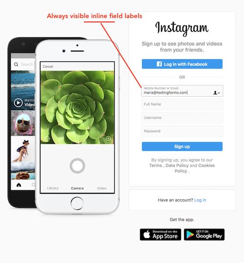
- Google’s UX researchers found that aligning labels top-left of the fields increased form completion time. This is because it requires fewer ‘visual fixations’. Basically, your eyes scan downwards faster. You are forced to scan in a zig-zag motion when the labels are placed to the left of the fields. The exception is when you are using always visible inline form field labels.
- Did I mention speed? You can make your website as fast as possible, but slowing down like molasses at the time of filling out a form is unacceptable. Make sure your forms load fast and don’t slow down your page speed to increase conversions.
- Make sure you are GDPR compliant. You have to ask permission for each and every opt-in.
Ready to AB Test? Read on!
UX Design Guide for Form Validation to Lift your Conversion Rates
Forms are a key component of Landing Pages (in addition to Offer, Image, Trust and Proof). When a visitor considers completing a form — for lead gen, to subscribe or to purchase — it is the moment of truth.
So, it is sad that so many forms work to chase these ready customers and prospects away. Forms are meant to have a conversation with the user. One that guides them all the way to the conversion with the best UX possible.
Form validation used to be a “developer” thing and we need to make it a marketing thing. Forms are placed at your sales funnel’s most crucial moment, the conversion. Therefore, it is only logical that improving the UX would help lift conversion rates.
Here are four elements to consider as you guide development of your website forms in these areas to avoid confusion:
1. When to Show Validation Errors: The right time to inform the user about problems or success
Consider the two main types of form validation: Inline validation and Post-Submit validation.
Inline validation checks field entries as the information is entered.
Post-submit validation validates entries after submitting the entire form. The visitor doesn’t know if the username they chose was already taken or if their email address was entered incorrectly until after they click the button.
If mistakes were made and the form re-loads, the visitor must manually search for the incomplete fields, and correct them. This adds friction to a shopping cart checkout process or a newsletter signup. This hurts completion rates.
Post-submit validation also suffers from scroll confusion. When the page reloads, the error messages often appear off-screen. The visitor may not know that there’s even a problem with their entry until they scroll around. This is a bigger problem on mobile devices where screens are smaller.
Our recommendation is to use inline validation so users can adjust, learn, and correct as they move from field to field. Inline validation is especially effective for the username and password fields, or any field with strict input requirements.
Don’t limit messages to errors. Success validation messages are always helpful and encouraging. For example, a simple check mark by the field can let the user know their username was accepted and it’s unique.
2. Where to Display Validation Errors: Right place for validation messages
When messages are located close to the corresponding “failing” field, they lead to a smoother path for conversion. They become easier to notice and to understand.
You may be tempted to add the error messages by the Submit button. But there are only two occasions where you can display the error or validation message next to the Submit button.
The first is when you perform an post-submit validation and there was no page reload.
The second is when the error affects the whole form, as may happen with a dropped mobile connection, and the page was not reloaded.
In any case, if there was a reload of the page, display the validation errors at the top of the page.
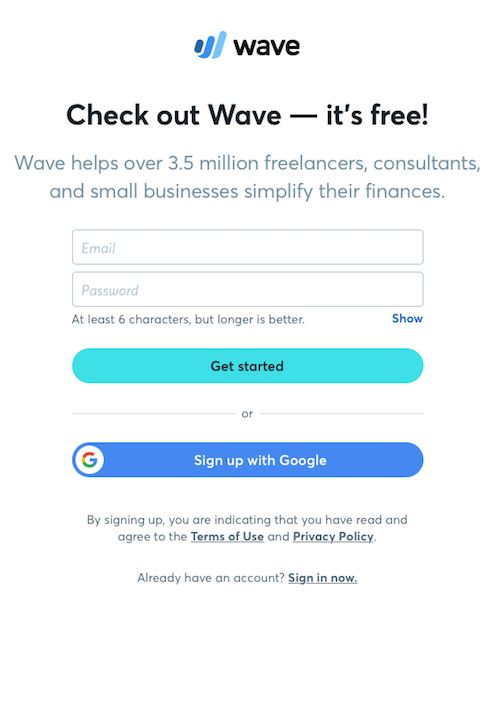
Wave accounting software registration form. Great location for the informational password field. Their social proof is very persuasive.
3. Right color or Right Graphic Representation
Did you know that 1 in 12 men have some degree of color blindness? Source: Color Blindness
Color blindness is more prevalent among males than females, because the most common form of color vision deficiency is encoded on the X sex chromosome. Source.
In spite of this, if you follow the rules (blue is informational, green is success, red is an error and yellow as a warning) even color-blind visitors will understand the meaning.
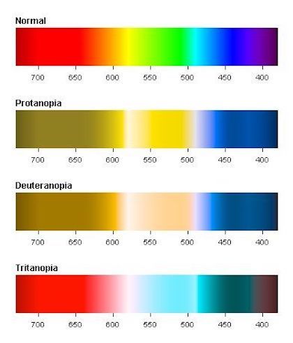
If red-green color blindness is the most prevalent – one in twelve men are color blind – should you rely solely on color to get your message across in your registration forms? Image source: Pinterest.
I recall asking a friend of mine – yes, he was color-blind – how could he tell the traffic signals apart. His answer was, “I know where they are placed.”
We don’t have specific placements on forms, but we can take advantage of icons. And these have rules as well: X for error, checkmark for success, exclamation point for warning and “i” for informational messages.
4. Clear and persuasive language for error messages
A red symbol notifying you that there is an error and no explanation of what it is or how to fix it can lead to form abandonment. It becomes extremely frustrating for users that may be trying to register for your demo or buy from your online store when they don’t know what they did wrong.

Instagram’s sign up form error messages are not helpful to the user. There is no clear explanation on how to fix them.
If all problems are opportunities, then error messages and error pages are generally missed opportunities. Marketing should be policing the errors reported on their website, messages that have traditionally been written by a techie in IT.
Clear and persuasive language for error messages can actually work in your favor, improving the user experience and increasing conversions.
I’ll give you an example. A few months ago I had to make a doctor’s appointment. The receptionist scheduled me for the following day with the nurse practitioner. I asked if I could see the doctor – best dermatologist in this neck of the woods – and her answer was “No, you will have to wait until she comes back from vacation.” Which happened to be 3 days later.
What do you think would have happened if she would have said, “Of course. She will be back from vacation on this date. But we can get you in tomorrow if you’d like to see her nurse practitioner”. She could have probably have persuaded me to see the NP.
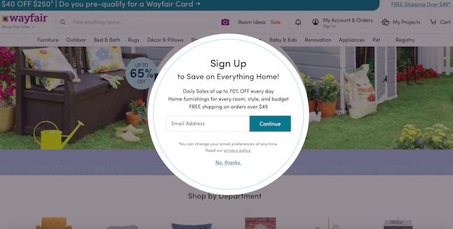
Wayfair’s newsletter sign up form has a confusing call to action button text. What will happen after I press continue?
Related Reading: Why is my Conversion Rate Dropping? 8 Common Reasons
How to Write Great Error Messages
Follow these guidelines to write error message that won’t have your visitor feel like an idiot.
- Get rid of IT jargon. Say goodbye to “Submit”, “Send” or “Error”, not only do they have different meanings in English language, they have a negative connotation putting the blame on the user.
- Clearly and simply identify the error and give the user a solution.
- Never blame the user. Rephrase your error messages or better yet, provide your website visitors with informational messages so they know what to enter in the first place.
- Provide a way to contact you, be it chat, email or a customer service number, in case the user needs your help to solve the issue.
- 7 Simple & Effective Ways to Improve Your Email Open Rates - February 23, 2021
- The 3 Most Effective Marketing Strategies For Ecommerce Businesses - December 26, 2020
- Google Ads not Converting? Try These 4 Optimization Tricks - August 6, 2020

